Task
Website design for a start-up company of Handmade baby products - Bubu. They create lifestyle products for all toddler needs: eat, sleep, play, repeat. The project was to create their website; which also demanded building a brand identity as the client did not have anything in terms of communication design.
Solution
Used existing products at BUBU to creat visuals of the website. It adds textures, prints, materials as all products are handmade and needs to inspire/tickle the feeling to touch and feel the products. Read more in the 'Design Process' section.
Done at: Bubu| 20 hrs/3 weeks
Year: 2014
Platform: Responsive - Website, tablet, mobile
Tools Used:
SOFTWARE: InDesign, Photoshop, Illustrator, Balsamiq Mockups, JavaScript, HTML5, CSS3
HARDWARE: camera, pencil sketches

Design Process
Branding
This is actually my second attempt on starting a entrepreneurship, this one is done for my Mom. A gist explaining ‘How it all began!’ is documented here.
To start a quick exercise was conducted to identify what the product categories will be focusing on :eat, sleep, play, repeat. Also a quick creation of Bubu logo, and mascot if needed was created to inspire the look and feel for the brand and website.


Client Definition
This exercise was conducted to identify the clients business type, its objectives, tasks and goals for the website. This will help further to understand the user-base, competition. It also helped to conduct first user interviews to identify different use-cases as well as the user behavior.
I added a aesthetic element of a quilt as its a woven meshed use-case and not like a 'concept mapping' exercise.I like to design every aspect of the project to match/add to the experience not only the user but also for the client.


Persona
Interviewed around 5 - 10 potential users to build the persona/user profile. That helps to understand the users and design for them.
Focused on 2 main types of potential users for Bubu Website:
- The mom of the toddler
- Relatives/friends who might gift toddlers on special occasions


Pencil Explorations
Rough and dirty rough sketches to explore all the possibilities of interactions. There were around 7-9 explorations, some of them are documented here.


Sitemap
A sitemap was built to understand the task list and task flow. The site map was very simple which inspired me to try and design the UI/UX for the website simple too. It will also cater to the needs of the Persona's; wanting non-time consuming, fast browse-able website.

Wireframes
- Click-able wireframes were created
- performed Usability testing with 10 -20 people


Typography
- Designed Logo
- Font Choices
- Colour recommendation

User Interface
UI design was heavily influenced by the end-user interviews and the products the brand would be rolling out as well as the making process of the products.

Click on any image (below) to view the slide, showcasing all the pages.
 The products available at the store are used to create the Visual Design for the website. So every page acts as a showcase for the products available at Bubu. |  On hover, the products show price, and when clicked will navigate to the particular product page. | 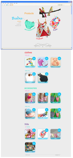 Overview of the complete product page with the web window defining what is seen in the first-fold. The clothes on the rope are 'anchor links' to the listed category below. |  When a certain category is clicked the list of products for that category open in the same location. This is done to minimize long breadcrumbs and getting lost in the website. This design makes the categories more organized and available on 1 page making it less stressful and more time-saving catered exactly for the user profile Bubu has. |
|---|---|---|---|
 This image shows the previous page viewed on a screen. The design will fall in the first fold for most screens as the 'product square' is less than 600 px |  Hover on the 'buy' button. A slight gradient added to the button for hover effect. |  Message when the product is added to cart. The message is fun and cute: it resonate's to the brand values, and the feeling/mood of the user. Hence creating affection towards the brand and makes shopping more fun. |  Design is kept simple. Product picture followed by name and then the price. The separators are dashed line which resonate to the machine stitch. You see the same dashed line for the foorter separation on all pages too. |
 hover over effect on the button 'Checkout' |  Conformation message + Encouragement to share on social media or continue shopping. Social media is important for this business as it is new and more people share more the recognition. Back to shopping button was added after user testing, older age group din't think of clicking on the logo to go back to home on this page. | 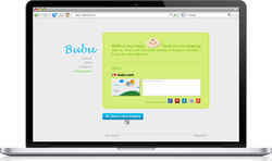 Hover-over effect on button 'continue to more shopping' Clicking on the logo always does the action of going to the landing page too |  Design that falls within the First fold of the window is demonstrated by the web window outline Alien plush toys are added as a 'pun' on the contact page. |
 hover effect on the 'send' button |  Message after clicking on the 'send' button. Conformation message always helps users or else user-test showed people re-sending again and again. Made this message 'cute' too to go with the theme. |
Marketing Collateral
- Images created for branding on FaceBook and Etsy
- Exhibition flyer in color and B/W. B/W version saved the printing cost by 90%

